10 best car infotainment systems in 2025
We put 10 of the most popular car information systems head-to-head to see which is the easiest to use
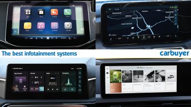
Like it or not, modern cars are becoming increasingly digital, and drivers are having to rely more and more on infotainment touchscreens to control basic functions. For many drivers, it’s a trend that’s hard to justify – we all know how dangerous it is to use a mobile phone while driving, so how is a big, in-car touchscreen any different?
Tesla was one of the first brands to adopt this approach, fitting its revolutionary Model S saloon with an enormous 17-inch touchscreen in 2012, and other brands were quick to follow suit. Replacing the various physical switches, dials and knobs with a single digital panel helps to cut design, development and manufacturing costs, while adding some visual showroom appeal.
The latest systems have improved leaps and bounds over the past decade, with snappier processors, sharper graphics and more intuitive menu layouts, but the same problems persist. For many drivers, trying to hit a small target on a touchscreen while driving is a lot harder than finding a physical button, to the point where it can become distracting.
The problem is compounded for right-hand drive cars in the UK, as the majority of our population is right-handed. It’s harder to accurately press a touchscreen with your non-dominant hand while driving, and that’s before considering the increased difficulty for some elderly drivers or those with limited mobility.
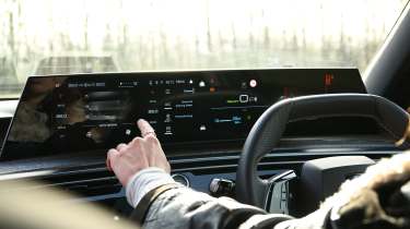
If you’re in the market for a new car, then you’ll probably be weighing up several models, each with a different infotainment system. To help you make your decision, we’ve put 10 of the most popular infotainment systems head-to-head to find out which is the least distracting to use while driving. We put them through several tests designed to simulate using important controls while driving – you can find the full results at the bottom of the page.
How we tested the infotainment systems
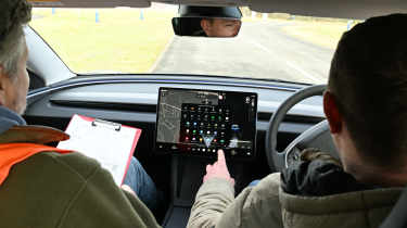
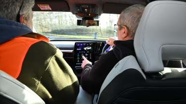
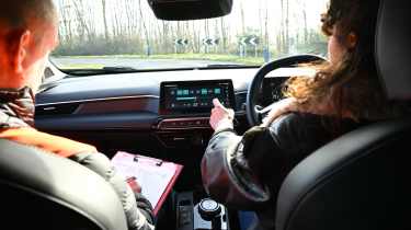
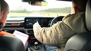
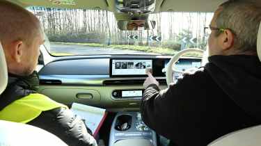
Each infotainment system was tested by three drivers with varying degrees of experience using in-car tech. The 10 cars were driven around an identical route designed to mimic a 20mph urban area, while the drivers performed a series of tasks using the infotainment system.
Each of the five tasks were timed by a judge in the passenger seat, which provided an indication of how easy each system was to use on the move. An overall lap time was also recorded and compared to a ‘non-distracted’ lap time, where the driver had no tasks to carry out. This gave us an additional metric to identify how distracting each system was to use.
The five tests included:
- Turning off the lane-keeping assistance
- Turning on the sat-nav and setting navigation to ‘home’
- Raising the cabin temperature by two degrees
- Turning on the heated seats
- Turning on the radio and switching to BBC Radio 4
Each test was performed by the drivers three times and an average time was calculated. The times for each of the five tests were then averaged out to provide an overall ‘distraction time’ – the shorter the time, the less distracting the infotainment system. Of course, every driver is different, so a distraction test will never be an exact science, but the results give a good indication of which systems are easier to use than others.
The best infotainment systems
Read on to find out the 10 best infotainment systems, ranked from least distracting to most distracting.
1. Skoda Navigation
- Car tested: Skoda Superb
- Average distraction time: 4.8 seconds
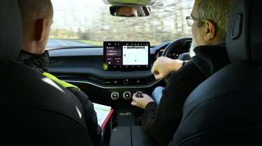
After several rounds of testing, it was Skoda’s infotainment system that came out on top as the least distracting to use while driving. The brand’s combination of an intuitive touchscreen and some physical controls gave the Skoda the edge in the five tests, resulting in an overall distraction time for each task of under five seconds.
Key to Skoda’s success was its ‘Smart Dials’. While most manufacturers are cutting physical controls from their new models, Skoda has done the opposite and innovated with its set of three dials. These are used for a variety of functions, including cabin temperature, controlling the heated seats and even zooming into the navigation map. The touchscreen itself is intuitive and clear, with some helpful shortcut buttons that you can customise.
It’s important to point out that we were driving the Skoda Superb in our test. Not every Skoda model gets the all-important Smart Dials that help make the system so easy to use.
2. Mercedes MBUX
- Car tested: Mercedes E-Class Estate
- Average distraction time: 6.8 seconds
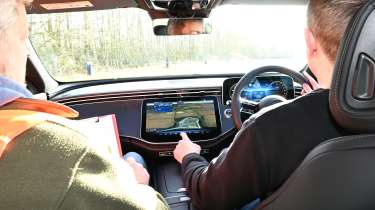
Despite coming two whole seconds behind the Skoda, it was the Mercedes E-Class Estate and its MBUX infotainment system that came runner-up in the distraction test. Unlike many rival systems, MBUX has been completely developed in-house by Mercedes, meaning it’s been able to fine-tune it to work seamlessly with its various models.
In the E-Class, MBUX runs on an enormous 14.4-inch central touchscreen. Some drivers might find its angled positioning a bit unwieldy, and its location on the dashboard means your arm will be floating in mid-air when trying to press anything. But get used to the menu system, and MBUX is slick and easy to use, with quick response times and handy climate controls permanently fixed to the bottom of the screen.
It didn’t perform particularly well in the climate setting or the sat-nav tasks, but it pulled back strong performances for radio tuning and turning off the lane-keeping assistance. Extra points for the physical heated seats controls, which are located on the doors.
3. MINI OS9
- Car tested: MINI Countryman
- Average distraction time: 7.2 seconds
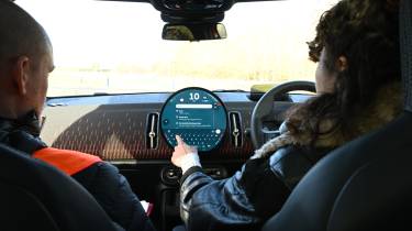
Sit inside any modern MINI and it’s the infotainment system that will undoubtedly catch your eye. In case you hadn’t noticed, it's circular, giving it some unique visual appeal among its competitors. That’s all well and good, but most drivers will be more concerned about how easy it is to use, and fortunately it performed well in our test.
The circular shape does mean that the screen can get a bit busy with information at times, but it’s pretty straightforward to use once you’ve memorised the key menus. The main drawback of that circular display is the cramped view for Apple CarPlay and Android Auto. They’re squished into a square within the round screen, making them appear smaller than in some rivals, so you may want to look elsewhere if you use these systems often.
Functions like turning off the lane-keeping assistance, setting the radio station and adjusting cabin temperature were all relatively easy to do while driving. We found changing the fan speed a bit annoying as this is only possible through a sub-menu, but we like the permanent shortcuts for temperature and the heated seats.
4. Volvo Android Automotive
- Car tested: Volvo EC40
- Average distraction time: 7.4 seconds
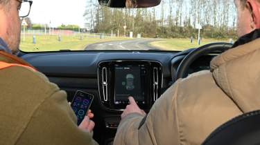
Trailing the MINI by a fraction of a second, Volvo’s Android Automotive infotainment system only just missed out on a podium position. The nine-inch touchscreen isn’t Volvo’s latest display and feels a tad small in this company, but the software underneath is cutting edge. It’s based on Google’s Android Automotive, which means you get some useful features baked in, like Google Maps and Google’s voice assistant.
There’s a row of digital climate controls permanently fixed to at the bottom of the screen which is handy, although they do eat into the limited screen room. Importantly though, the portrait screen is mounted close enough to the driver to make it easy to reach, while there are some physical controls beneath for audio volume, skipping tracks, drive modes and front and rear screen heaters.
The on-screen menus are logically laid out, although some might find the icons a little small. There are some minor annoyances, too, including the two presses it takes to turn on the driver’s heated seat and the slow loading time for Google Maps.
5. Tesla UI
- Car tested: Tesla Model 3
- Average distraction time: 7.8 seconds
Tesla may have written the rule book for modern day infotainment systems, but its latest effort only landed it in the middle of the pack in this test. The giant 15.4-inch screen is practically the only interior embellishment you get, with no physical controls besides a handful of steering wheel buttons.
Fortunately, the digital system is well thought-out and easy to grasp, with rapid response times and clear visuals. There’s no separate driver’s display, which can take some getting used to – instead, a portion of the central screen is dedicated to your speed and other driving information. The screen is big enough to ensure this isn’t an issue, and your favourite app icons are clearly displayed at the bottom of the display.
That said, Tesla’s system put in an underwhelming performance in some areas, including the heated seats, lane keeping assistance and cabin temperature tests.
6. Renault OpenR Link
- Car tested: Renault Scenic
- Average distraction time: 8.1 seconds
Like Volvo, Renault uses Google’s Android Automotive as the underlying software for its infotainment system, with a unique skin over the top to give it a distinct style. It’s not quite as intuitive as Volvo's system, however, with its 8.1-second distraction time falling in the bottom half of the group. The drivers agreed that there was a lot to get your head around initially – particularly the unconventional controls behind the steering wheel – but the experience improved once they learned where the key controls were.
The screen itself is a crisp, 12.3-inch portrait display, with easy-to-read graphics that will feel familiar to anyone with an Android smartphone. Of course, there’s Apple CarPlay and Android Auto support for anyone who prefers using one of those systems, although Renault’s native software includes Google Maps, Google voice assistant and the Google Play Store from the factory.
Still, the drivers found it a bit trickier to change the radio station and turn off lane-keeping assistance versus some of the other cars in this test. It also set the slowest lap time compared to the non-distracted lap. On the plus side, the bank of physical switches are a nice touch and make jumping to certain menus much easier than prodding the touchscreen.
7. MG iSmart
- Car tested: MG3
- Average distraction time: 8.6 seconds
MG is a brand known for its budget-friendly models, so we weren’t expecting its latest infotainment system to top this test. Still, the £19,000 MG3 performed admirably against much pricier competition, even if none of its individual results were particularly impressive. A relatively small screen and basic graphics somewhat give away the MG’s price tag, but we were pleased to see some physical switches for menu shortcuts, plus a volume knob.
It’s a bit frustrating to have to navigate through several menus to activate and deactivate some functions, including the lane-keeping assistance. When you reach the menu you want, the toggle switches are on the small side due to the slightly cramped nature of the screen.
There’s Apple CarPlay and Android Auto connectivity should you want it – although it’s not wireless – but we found the climate control shortcut button didn’t work when these systems were running. You instead have to close CarPlay and then open the climate menu, which feels unnecessary when you just want to turn the fan speed down.
8. Ford SYNC 4
- Car tested: Ford Mustang
- Average distraction time: 10.1 seconds
Ford’s SYNC 4 system fitted to the latest Mustang came a disappointing eighth place, with one of the drivers’ main gripes being its laggy response times. While this could have passed for the norm a few years ago, it doesn’t feel up to scratch in this competition, where the best infotainment systems feel just as slick as a smartphone.
Interestingly, SYNC 4 came out on top for the heated seat test, thanks to its one-touch digital buttons at the bottom corners of the display. But that couldn’t make up for its dead last performance in the sat-nav task and other disappointing results for radio tuning, cabin temperature and lane-keeping assistance. At least the menu system felt fairly logical, with large widgets on the home screen and a fixed climate control bar.
9. Peugeot i-Cockpit
- Car tested: Peugeot E-3008
- Average distraction time: 10.4 seconds
Peugeot’s i-Cockpit has been through several iterations over the years, and the latest version is the most sophisticated yet. Unfortunately, it looks like the French brand still has some work to do, as it came second-last out of the 10 systems we tested. It undoubtedly looks the business, with a sweeping digital display sitting above the dashboard and a small, sporty steering wheel.
There’s another small digital display a bit lower down, split into six different sections for customisable shortcuts. It works well, although we did notice a few bugs – the button for the driver’s seat massage activated the passenger seat, for example. There were more issues, too, including general unresponsiveness of the main touchscreen – as distracting as it is annoying.
The general consensus was that Peugeot’s i-Cockpit was just a bit too busy, with too many buttons and menus arranged in a bit of a haphazard fashion. Throw in laggy response times, and you can see why it posted one of the longest average distraction times.
10. Genesis ccIC
- Car tested: Genesis GV60
- Average distraction time: 13.6 seconds
Falling into a disappointing last place is the Genesis infotainment system. Named ‘connected car Integrated Cockpit’, the system is shared with the latest Hyundais, although the interior of the Genesis feels generally more upmarket. Its average distraction time of 13.6 seconds was well off the pace, with the drivers agreeing that it was the most confusing system to use.
The overly-sensitive touchscreen caused some mis-hits, landing the drivers in a menu they didn’t want. Navigating out of said menu was made tricky by unintuitive layouts, even though the general design and graphics were visually pleasing. It’s just not an easy system to jump in and use.
There were some redeeming features, though. The Genesis has lots of physical controls, offering a very different experience to something like the Tesla Model 3. You have shortcut buttons for certain menus, dedicated buttons for the heated seats, and a temperature knob – the latter helped it come out on top in that specific task. There’s even a BMW iDrive-style rotary controller, which is easy to operate while driving. But the drivers found the system just a bit too tricky to use overall.
Infotainment test full results table
Below is the complete results table from the infotainment test for the 10 cars.
| Test 1: Turn off lane- keep assist | Test 2: Turn on sat-nav, select ‘home’ | Test 3: Raise cabin temp by 2˚C | Test 4: Turn on heated seats | Test 5: Tune to BBC Radio 4 | Distracted lap time | Extra time taken vs. non-distracted lap | Average distraction time | |
| Skoda | 6.6s | 8.7s | 2.4s | 2.9s | 6.0s | 2m 44s | 22s | 4.8s |
| Mercedes | 7.0s | 16.5s | 6.8s | 2.0s | 3.2s | 2m 52s | 30s | 6.8s |
| MINI | 10.4s | 15.7s | 3.7s | 4.1s | 4.5s | 2m 40s | 18s | 7.2s |
| Volvo | 9.7s | 14.0s | 4.2s | 3.2s | 5.7s | 2m 34s | 12s | 7.4s |
| Tesla | 11.7s | 13.7s | 4.4s | 6.6s | 5.4s | 2m 54s | 32s | 7.8s |
| Renault | 19.6s | 9.7s | 4.3s | 1.9s | 7.7s | 3m 03s | 41s | 8.1s |
| MG | 10.4s | 18.1s | 5.3s | 5.0s | 5.4s | 2m 49s | 27s | 8.6s |
| Ford | 13.4s | 24.8s | 4.7s | 1.5s | 8.1s | 2m 48s | 26s | 10.1s |
| Peugeot | 15.3s | 11.6s | 6.8s | 1.8s | 19.3s | 2m 59s | 37s | 10.4s |
| Genesis | 22.6s | 19.3s | 2.3s | 6.3s | 19.7s | 2m 58s | 38s | 13.6s |
Read more about the best electric cars and the best hybrid cars on sale today
Recommended
In-car safety assistance systems leaving drivers confused and dissatisfied
What is Android Auto? Apps, music and new gaming features
What is a CVT gearbox? Reliability, pros and cons, and E-CVTs
Most Popular
New Smart #5 Brabus is a 637bhp far cry from the brand’s city car past
Skoda Fabia review – a great-value, practical supermini
Tips & advice

Car dashboard warning lights: what does each symbol mean?
Electric car charging stations: public networks, charger types, apps and maps

